PMBC Group Client Virtualitics Featured on Forbes.
The way we present data to others has evolved from simple pie charts and bar graphs to sophisticated interactive visualizations drawing on real-time data sets. This helps us to communicate insights faster and more effectively.
It’s only the start though, and as the data available to us grows increasingly complex and fast-moving, techniques for presenting it are continuing to evolve. Today’s Big Data projects often involve amalgamating hundreds of data sources, structured and unstructured, and it’s likely that 2D images, or even 3D ones presented on a flat screen, will no longer cut the mustard.
Shutterstock
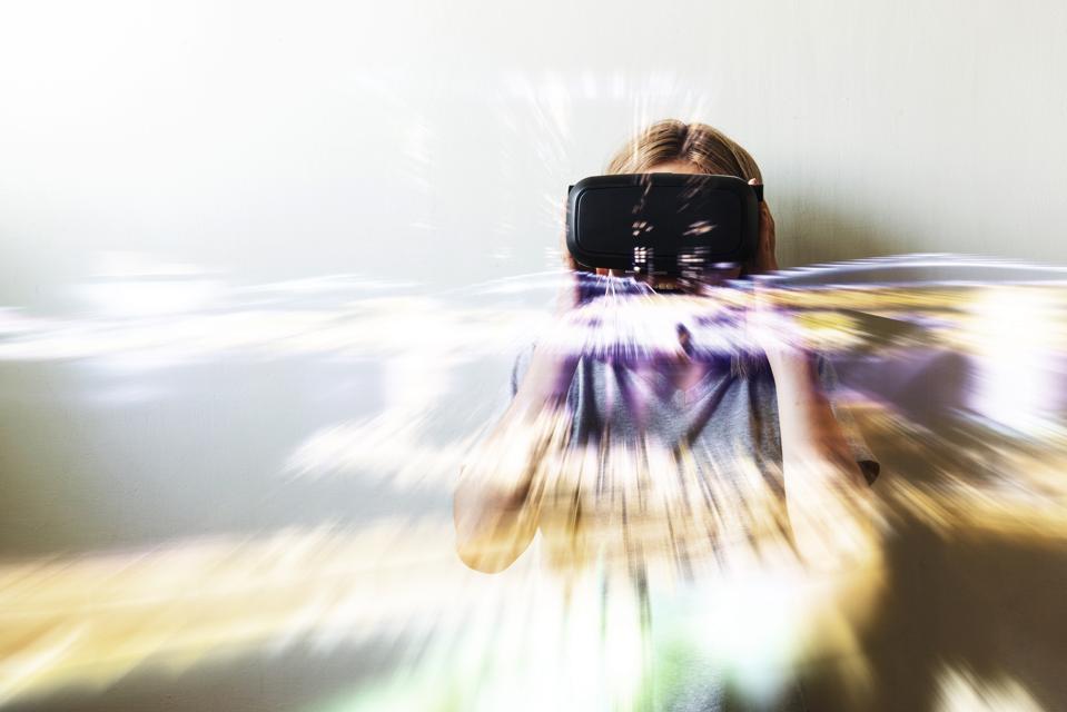
Virtual reality and augmented reality – at the moment primarily considered a medium for delivering entertainment – offer the intriguing possibility of letting us “step inside” the data. 360-degree vision instantly broadens the available canvas, and interactions become more intuitive as we can reach out to touch and manipulate what is shown to us.
One provider of such a solution is Virtualitics, whose technology is currently being tested by clients in the finance, pharmaceuticals and energy industries. Their CEO and founder Michael Amori talked to me about how fusing machine learning with VR and AR-driven reporting will help unlock the potential of Big Data for an ever-growing range of organizations and enterprises.
“The motivation is simple,” Amori tells me, “the amount of data in the world doubles every year according to some sources and the amount of that data which gets analyzed is less than one per cent. Having been in charge of a trading desk on Wall Street for seven years, I know that, of that data which does get analyzed, a lot of the time, that analysis isn’t very useful.
This is largely due to the limitations of visualization and reporting tools which aren’t up to the job of presenting complex information in a clear and concise way.
“So, you hire a data science team and they find out that, of 100 metrics you analyze, there are five which produce the outcome you’re interested in. There’s currently no way to visualize all of those metrics at the same time – to see how they all interact – because we’re stuck looking at two or three things in a 2D scatter graph. If what you’re interested in is a function of five things, or eight or ten – you can’t visualize them all at the same time with traditional tools.”
By presenting data inside a 3D canvas which wraps around the user, far more than the traditional three dimensions become available. As well as placement on X, Y or Z co-ordinates, data points can be distinguished by size, colour, transparency, as well as direction and velocity of movement.
And while this all may seem fairly abstract it’s important to remember that it’s being presented via a medium which we have evolved over thousands of years to navigate intuitively – 3D space (or the illusion of it, at least). Bar charts, by comparison, have only been a part of our toolset for a couple of hundred years.
This means we can interact with the data in a way that is far more natural – reaching out to manipulate objects with our hands, moving around them to view them from a clearer perspective and highlighting objects of interest with a point of the finger…
To read the full article, click HERE.